
The Widget Builder
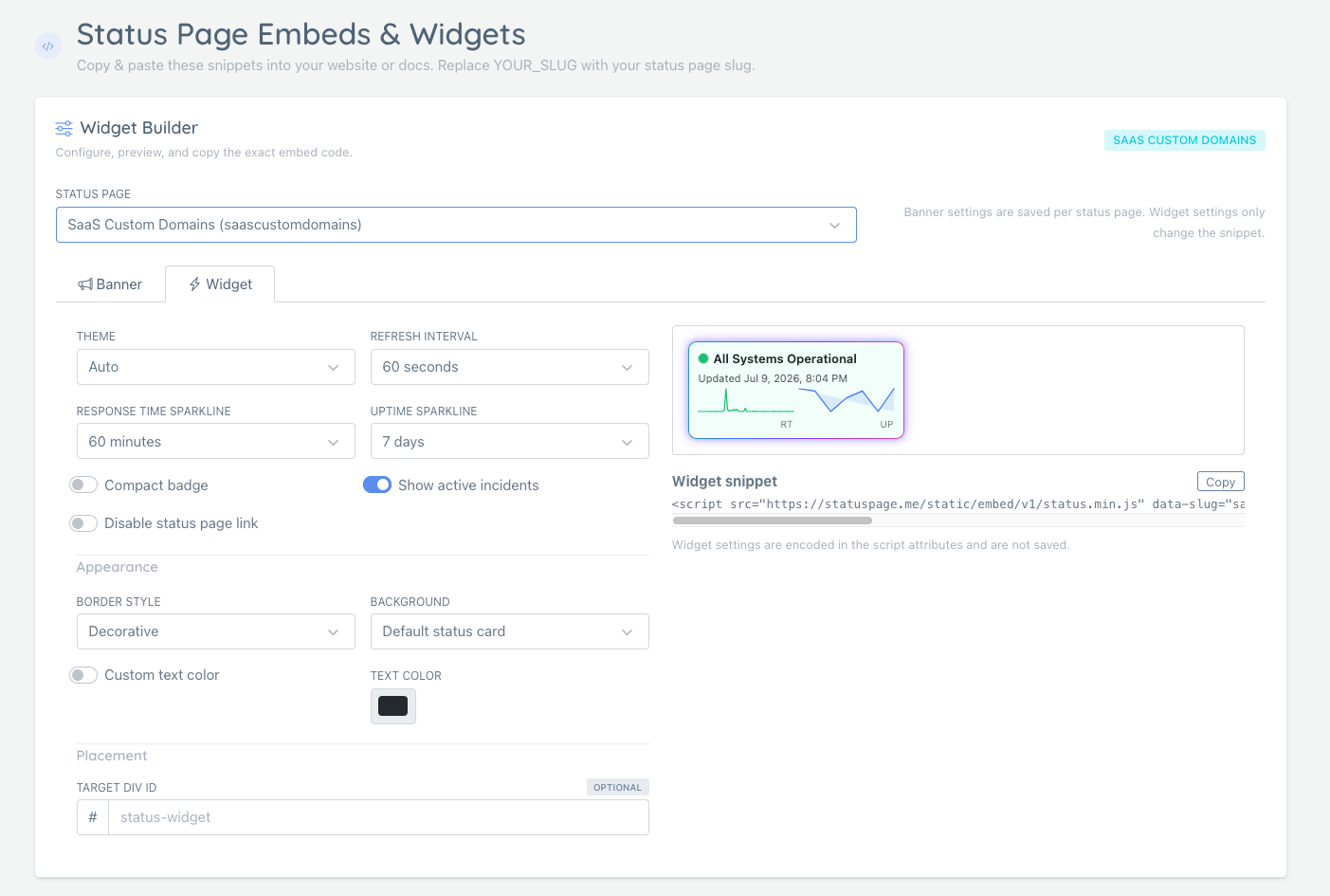
The Widget Builder helps you configure and copy hosted embed snippets for your status page.
It has two tabs:
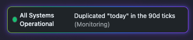
- Banner: a slim status strip for login pages, dashboards, customer portals, and app navigation
- Widget: a compact status card or badge that can show incidents, response time, and uptime
If you only need a slim strip for login pages, dashboards, or customer portals, see Embeddable Status Banner.
If you want to embed the full hosted status page in an <iframe> instead of a compact widget, see Embedding a Full Status Page.

What Is the Widget Tab?
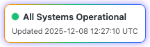
The Widget tab generates a small script snippet you can add to any website. It displays:
- Current overall status
- Active incidents (optional)
- Response time sparkline (optional)
- Uptime history (optional)
If your overall status is intentionally “softened” by certain monitors (for example, informational checks), see: Monitor Impact on Overall Status.
Widget settings are encoded in the script attributes. They are not saved to the database, so you can create different snippets for different parts of your site.
Getting Widget Code
- Go to Status Pages > Embeds
- Choose the status page you want to embed
- Open the Widget tab in The Widget Builder
- Configure the controls on the left
- Review the live preview on the right
- Copy the generated snippet
Basic Widget Code
Add this to any HTML page:
<script
  src="https://statuspage.me/static/embed/v1/status.min.js"
  data-slug="your-slug">
</script>
Replace your-slug with your actual status page slug.
Widget Builder Controls
The Widget Builder exposes the most common script options:
| Control | Script attribute | Values | Description |
|---|---|---|---|
| Theme | data-theme | light, dark, auto | Color theme |
| Show active incidents | data-show-incidents | 0 or 1 | Show active incidents list |
| Compact badge | data-compact | 0 or 1 | Use a tighter single-line layout |
| Refresh interval | data-refresh | milliseconds | Auto-refresh interval, minimum 10000 |
| Response time sparkline | data-rtm | 1-240 | Response time sparkline window in minutes |
| Uptime sparkline | data-upd | 1-30 | Uptime sparkline window in days |
| Disable status link | data-disable-link | 0 or 1 | Disable click-through to the full status page |
| Border style | data-decoration | decorative, quiet, none | Choose animated, simple, or no outer border |
| Background | data-background | default, transparent | Use the normal status card background or no background |
| Custom text color | data-text-color | CSS color value | Override theme-aware text color when needed |
| Target div ID | data-target | HTML element ID | Render inside an existing div by ID |
If a setting uses its default value, the builder may omit that attribute from the snippet.
Border Style
Use Border style to control how much visual framing the widget includes.
| Value | Behavior |
|---|---|
| Decorative | Animated status border. This is the default. |
| Simple | Static neutral border. Emits data-decoration="quiet". |
| None | No outer border, padding frame, shadow, or animation. Emits data-decoration="none". |
Use None when embedding the widget inside a navbar, menu, dense dashboard header, or any container that already has its own styling.
Animations are automatically disabled for visitors who use reduced-motion preferences.
Background and Text Color
Use Background when the widget sits inside a container that already provides the visual surface.
| Value | Behavior |
|---|---|
| Default status card | Uses the widget’s normal light, dark, and status-aware backgrounds. |
| Transparent | Removes the widget background while keeping theme-aware text colors. Emits data-background="transparent". |
With a transparent background, text still follows the selected theme:
data-theme="light"uses dark textdata-theme="dark"uses light textdata-theme="auto"follows the visitor’s system color preference
Enable Custom text color only when the host page needs an exact color match. The builder emits data-text-color for that override.
<script
  src="https://statuspage.me/static/embed/v1/status.min.js"
  data-slug="your-slug"
  data-background="transparent"
  data-text-color="#ffffff">
</script>
If you set a custom text color, make sure it has enough contrast against the page background.
Placement and Target Div ID
By default, the widget renders next to the script tag.
If you want the widget to render inside a specific element, set Target div ID in the builder. The generated snippet will include both a target div and data-target:
<div id="status-widget"></div>
<script
  src="https://statuspage.me/static/embed/v1/status.min.js"
  data-slug="your-slug"
  data-target="status-widget">
</script>
Use this when your layout requires the script tag to live somewhere else, or when your framework gives you a specific container for third-party embeds.
The target div must exist before the script runs. The builder-generated snippet puts the div first for that reason.
If the target cannot be found, the widget falls back to rendering next to the script tag and logs a warning in the browser console.
Widget Examples
Full Widget with All Features
<script
  src="https://statuspage.me/static/embed/v1/status.min.js"
  data-slug="your-slug"
  data-theme="auto"
  data-show-incidents="1"
  data-refresh="60000"
  data-rtm="60"
  data-upd="7">
</script>
Shows: status, incidents, 60-minute response time, 7-day uptime, refreshes every minute.
Compact Badge
<script
  src="https://statuspage.me/static/embed/v1/status.min.js"
  data-slug="your-slug"
  data-theme="light"
  data-compact="1"
  data-rtm="45">
</script>
Shows: compact single-line with 45-minute response time sparkline.
Borderless Navbar Widget
<div id="navbar-status"></div>
<script
  src="https://statuspage.me/static/embed/v1/status.min.js"
  data-slug="your-slug"
  data-theme="auto"
  data-compact="1"
  data-decoration="none"
  data-background="transparent"
  data-target="navbar-status">
</script>
Shows: compact status inside an existing navbar or menu container, without an outer border or widget background.
Simple Status Only
<script
  src="https://statuspage.me/static/embed/v1/status.min.js"
  data-slug="your-slug">
</script>
Shows: just the status headline, no extras.
Theme Options
| Theme | Description |
|---|---|
light | White background with dark text |
dark | Dark background with light text |
auto | Matches user’s system preference |
Where to Use the Widget
- Homepage footer
- Navbar or app menu
- Help center or support pages
- Documentation sites
- Admin dashboards
- Mobile app webviews
The widget is lightweight and won’t slow down your page.
Troubleshooting
Widget Not Appearing
- Check that the slug is correct
- Verify the script is loading (check browser console)
- Make sure there are no Content Security Policy blocks
- If you use
data-target, make sure the target div exists before the script tag
Widget Shows Wrong Status
- Check your status page is active
- Verify the slug matches your status page
- Allow a few minutes for caching to update
What’s Next?
- Use the embeddable status banner for a thinner in-app or login-page notice
- Embed the full status page when you want the entire hosted page inside your site
- Install the WordPress plugin if your site runs on WordPress
- Use the SVG badge when you just need a lightweight indicator
- Build custom integrations with our JSON API
- Browse all embed options in the Embeds & Integrations hub